Comparing Facebook and Twitter: Do You Know Your Audience?
Posted: January 03, 2011
You've committed to social media, but do you know which site fits your customer demographic best? Visualize and dissect the differnces between facebook and twitter users via this great infographic.
Visualizing Social Media Data
Mathew Ingram recently wrote a piece on GigaOM about the statistical differences between Facebook and Twitter users. In his post he includes an infographic, created by online agency Digital Surgeons and shown below, that gives details on demographics and activities for both platforms. As noted by Ingram, the creation of this visual aid was based on data from a Barracuda Networks survey as well as an analysis from Razorfish and other demographic breakdowns from a number of sources.
Some key findings represented:
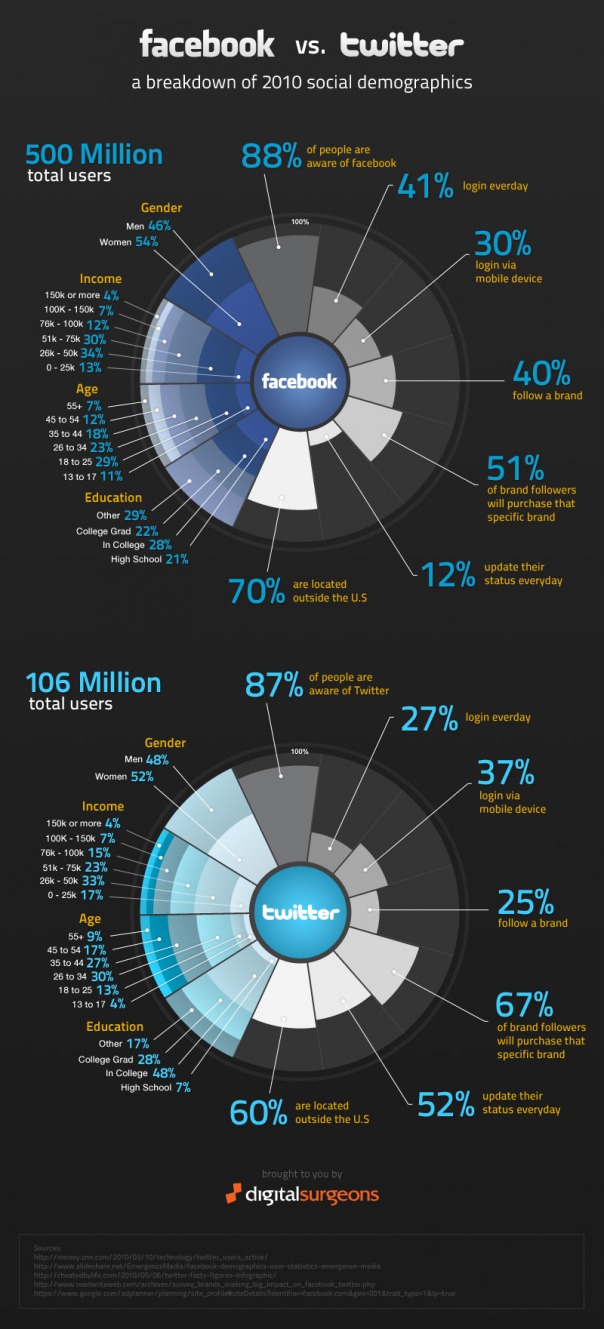
- 88 percent of people are aware of Facebook, while 87 percent are aware of Twitter
- 12 percent of Facebook users update their status every day vs. 52 percent for Twitter
- males make up 46 percent of Facebook users, and 48 percent of Twitter
- 30 percent access Facebook via mobile vs. 37 percent for Twitter
- 40 percent follow a brand on Facebook vs. 25 percent on Twitter
- 70 percent of Facebook users are outside the U.S. vs. 60 percent for Twitter
Interestingly, these stats sparked a flurry of comments on the age and accuracy of the data and the methods and math used to create the final tallies. What was noticeably lacking, in my opinion, was a discussion on how this information might be useful in, at the very least, catalyzing conversations with clients on how best to approach these platforms and tools, communities, users and would-be consumers.
And in visualizing the data, does the infographic help or hinder? Is there value to social data not tied to business data, regardless of how it’s presented? And in this instance, does it become more easily understood and integrated when sliced up and served in a visually engaging manner?
 Biz Tip Source: Talent Zoo
About the Author: ML Haynes, hybrid creative and interactive director, pixel pusher and wordsmith, strategist and activist, thinks out loud here.